Neighborhood Design Challenge and HCD – By Ayesha Wahid
#Architecture #hcdconf #healthcaredesign #healthcareenvironments
Share
When E4H’s internal design competition was first announced, I was incredibly excited. Having recently finished my thesis, it was exciting to be in an environment where experimental thinking was encouraged. While my teammate Merielle and I, had little knowledge of neighborhood hospitals, the prospect of researching and furthering my industry knowledge was a welcome challenge. All teams were provided with past examples of E4H’s recent neighborhood hospitals, a valuable resource.
CONCEPT AND PLANNING
We dove into research on neighborhood hospitals, current trends in inpatient healthcare, patient experience, etc.. At this stage, we were trying to understand what we wanted this project to be, what our big idea or concept was which would eventually drive the design. We started to outline certain problems that we felt were not being addressed. One that stood out to us was the isolation that people within a hospital can feel, be it the staff, the family, or the patients themselves. The hospital can seem removed from the rest of society. Thus, the question arose – how to decrease this feeling of ‘otherness’?
We brainstormed about different social spaces – Central Park, farmers markets, the High Line, and what made them successful. We soon found that certain key words were common in all of these spaces – interaction, nature, daylight, being outside, etc. From here, our concept began to form. We realized that what made those spaces successful were the way they enabled the senses, and that they were all outside. We imagined a hospital which wrapped around a public space, offering access to everyone in the neighborhood. This space would be visible to everyone within the hospital, making them feel connected to the community instead of removed. Then came the problem of how to avoid making people in the hospital feel like they were on one side of the glass looking in. This is where the senses came in, we thought of incorporating the same elements you would experience on the other side of the glass within the hospital.
CHALLENGES FACED AND TOOLS DISCOVERED
In the early stages, it was difficult learning how to balance our daytime workload and the excitement of the design competition. In the end, it was a great lesson in time management. Being so new in the industry, we struggled with navigating medical planning and program requirements. Since the neighborhood hospital concept is still a relatively new topic in the field of healthcare design, there was only so much we could find online in terms of planning. Luckily, we were able to refer to the database of previous neighborhood hospitals that E4H has designed. This was critical in our understanding of flow and important adjacencies.
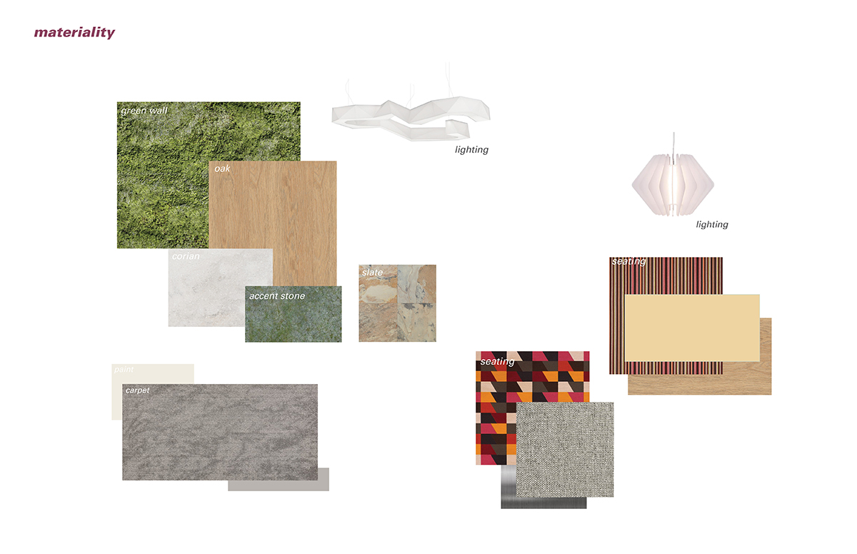
As designers, even with a conceptual project like this, we wanted to make sure that the materials we pulled were free of toxic substances. This required some extra attention to detail and further research. Design Seeds proved to be a helpful site for quickly putting together our color scheme for a graphic presentation. The platform posts beautiful pictures of nature, architecture, food, etc., and creates color palettes pulled from these images. When deciding on what graphic style we wanted to pursue for our renderings and presentation, we looked at Visualizing Architecture. This website has a diverse gallery of architectural illustrations like drawings and renderings, which serves as a good starting point for graphic inspiration and offers tutorials. Since our concept was rooted in stimulating the senses, we used a collage type of rendering style to highlight the colors, textures, etc. of the space.
PRESENTATION DAY
On the day of the competition, each team was given 30 minutes to present their design for the neighborhood hospital challenge with additional time for questions and critique at the end. The presentations were carried out over an online Go-To-Meeting held in the conference rooms of all offices. Everyone was invited companywide to view the presentations and ask questions either via the chat tool or by calling in. We were all given the exact same program, and yet each team approached and tackled it in their own way. It was amazing to see the skill of our colleagues in their planning, renderings, and design. We were the third team to present and it was incredibly encouraging to have several people from the New York office in the conference room with us while we did so. We received many questions, fantastic feedback, and great suggestions. The various judges were given a grading matrix which was used to place the different teams. Merielle and I were honored when we found out we had placed second.
COCKTAILS AND CRITIQUE EVENT AT HCD
The prize was an all-expense paid trip to the Healthcare Design Conference in Phoenix where we would get the opportunity to present our concept at the Cocktails and Critique Event. This event was organized for the two teams to present their design during a cocktail hour networking event. Clients were invited to view and critique the finalist’s projects. Each team had two concise boards with which to present when the guests came over. It was very educational to hear the assessments and recommendations from the client side of hospital design.
Taking part in the internal design competition was an amazing, challenging experience. We were able to explore new skills, make new connections and gain access to a wealth of knowledge. It is exciting to work at a firm that supports and fosters creative thinking and design and we highly recommend taking part in such competitions to anyone who is interested.
FINAL DESIGN
Our final design included the following elements.
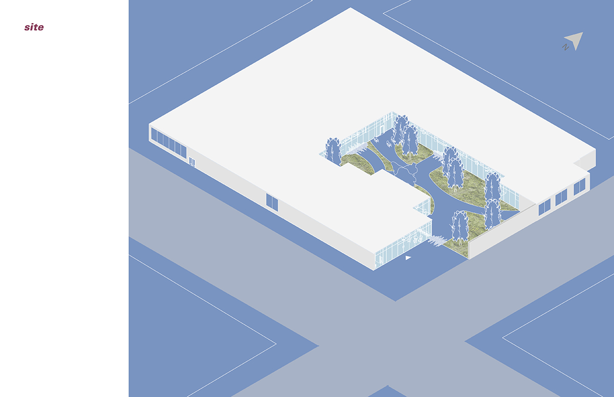
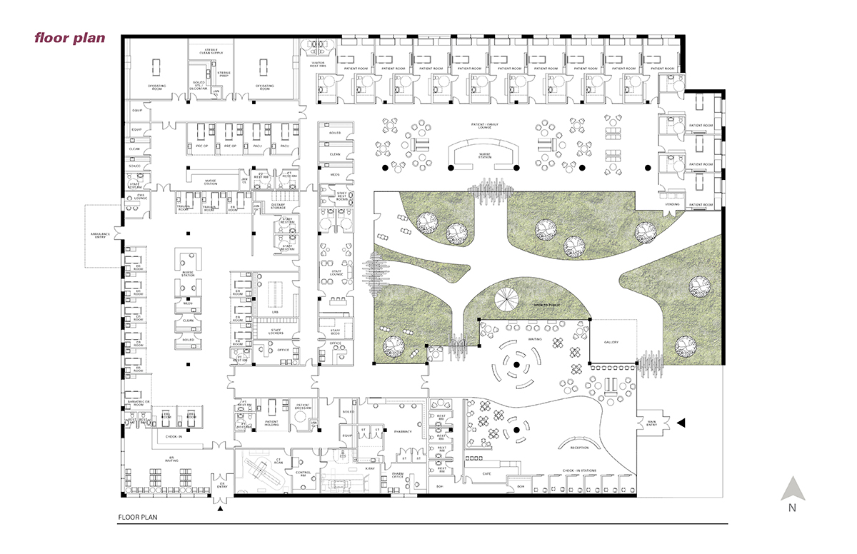
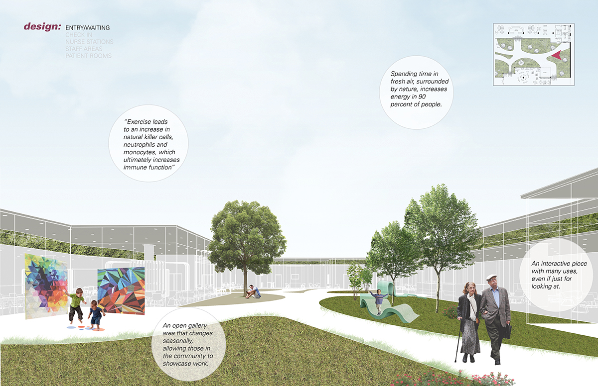
A neighborhood hospital which wraps around a large public green space. This courtyard houses a gallery space with rotating exhibits of art and sculptures by local artists. It is also home to a sculptural playground of sorts, which can be used by children but may also attract the attention of adults. The courtyard has paths for evening walks and views into public spaces of the hospital.
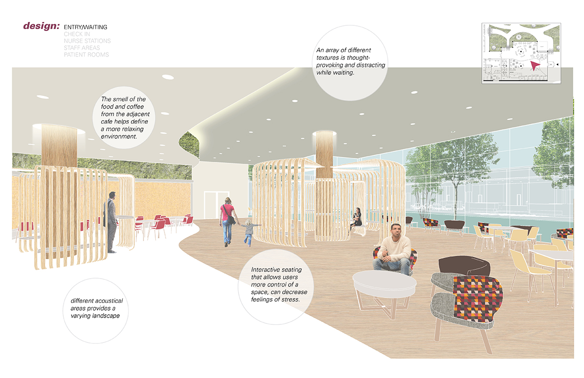
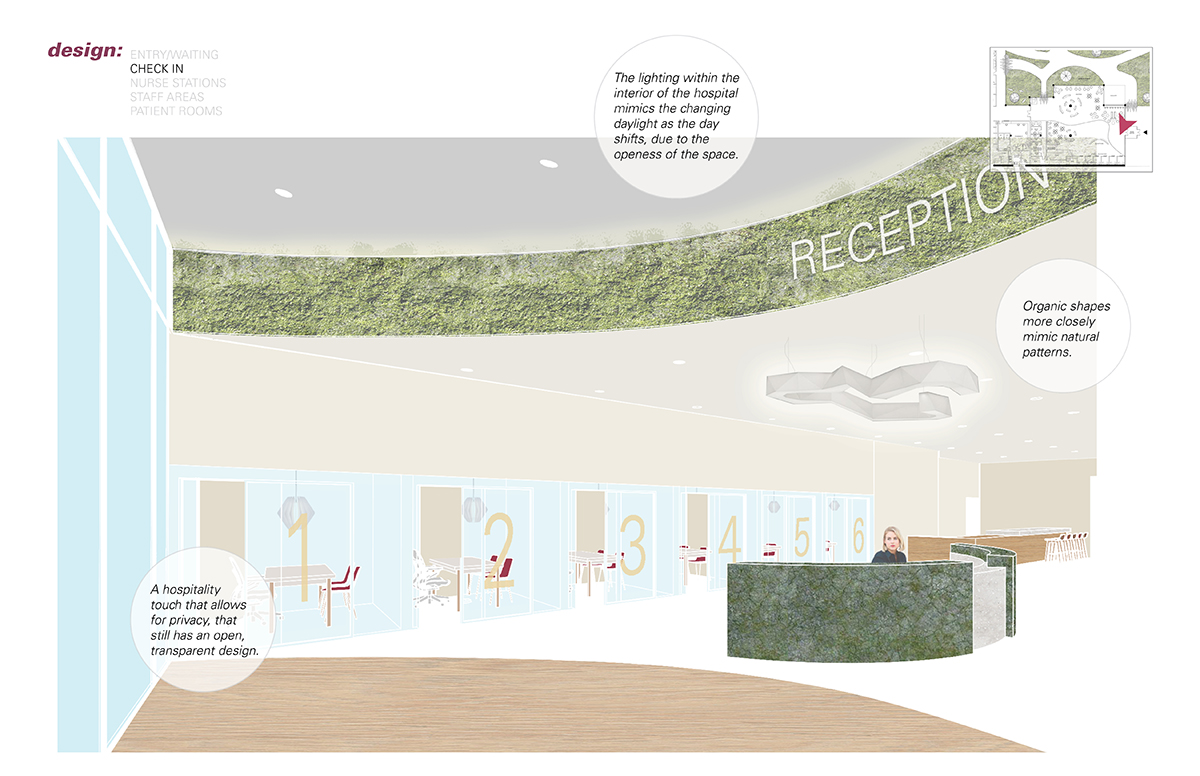
The entry waiting area is large and open, with a variety of seating options including intimate booth seating, hospitality like lounge chairs, as well as a couple of experiential pieces. These movable sculptures house surfaces at seating and bar heights, encouraging users to move them around. It is meant to serve as a form of positive distraction. The waiting area has unobstructed views into the courtyard and a hospitality-like cafe area serving healthy foods and beverages. Ceiling height changes identify various seating areas with a beautiful green soffit. When the client walks in, they are greeted by a receptionist and then directed to check in stations which are semi-private, each numbered in a bold, graphic style.
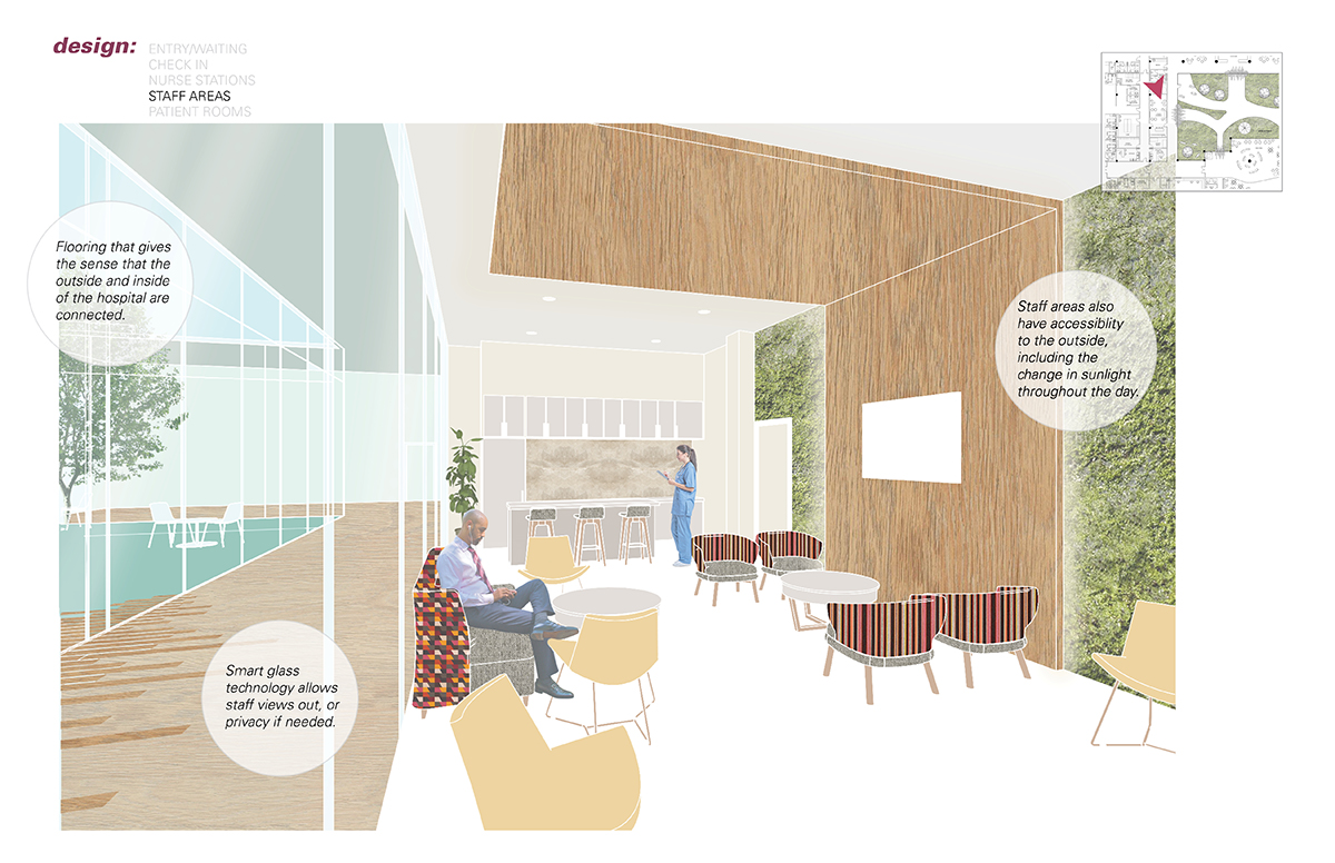
We also kept in mind the experience of the staff. The staff quarters are placed along the main corridor with views out to the courtyard. Keeping in mind their privacy, the glazing is operated with smartglass technology which allows them to switch on and off the translucency of the glass. Staff are provided with a fully equipped kitchenette, lounge furniture, and touchdown areas. In the adjacent corridor, the wood tile extends into the courtyard to give the sense that the lines between the inside and outside are blurred.
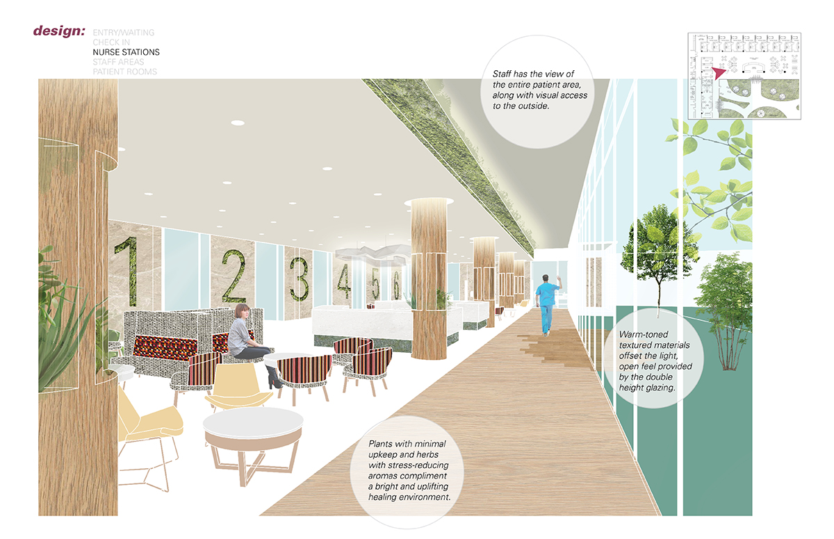
Past the public corridor, we then enter the patient room zone. The family waiting area is centered with a large nurse station with a view into the courtyard. Here too, ceiling height changes differentiate between circulation and seating areas. Here is a spot for clinicians to speak with family members enabled by the intimate, private furniture. The columns are furred out and embedded with plants and herbs that positively impact the air quality.
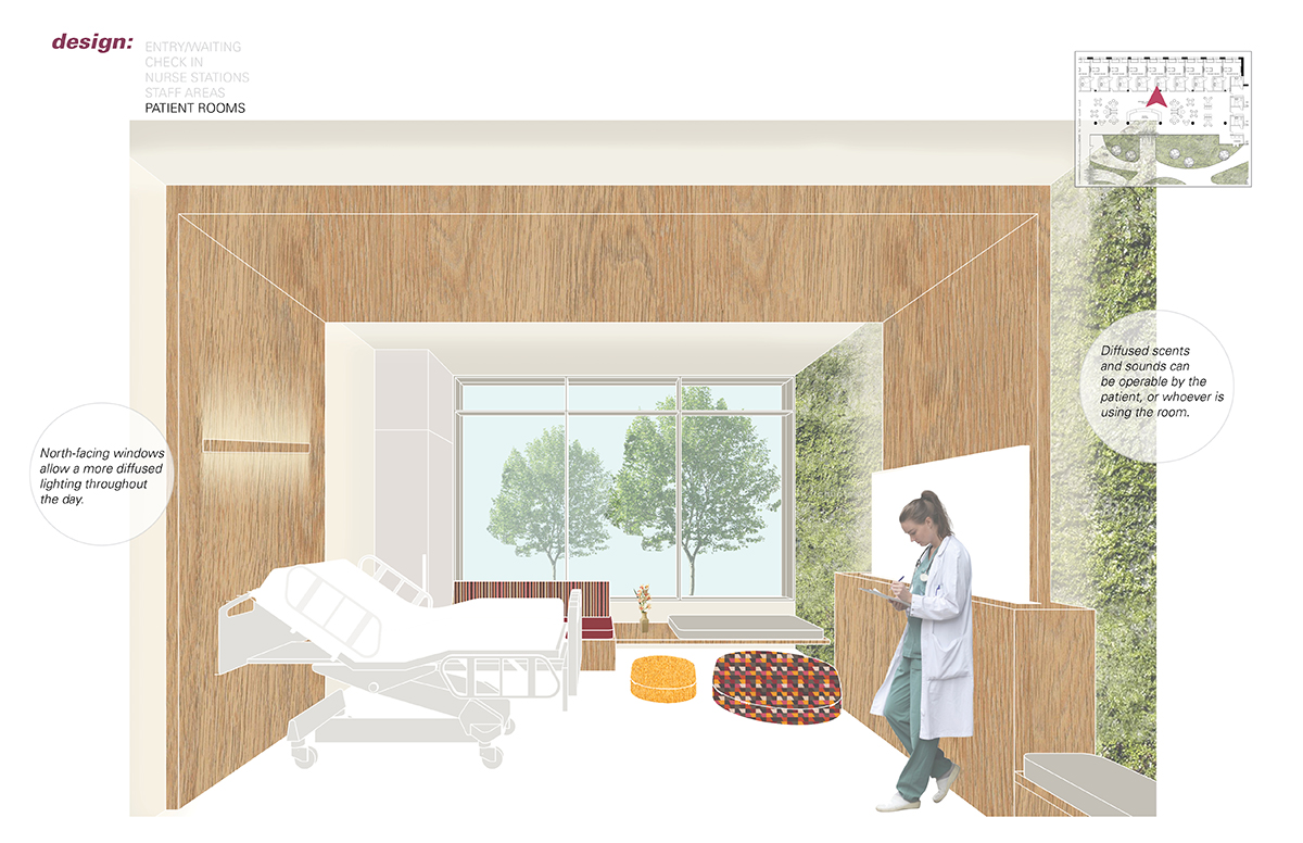
The patient rooms are numbered in a graphic style similar to the check-in stations at the entrance. Rooms are placed alongside the glazing, allowing for natural light in each patient room. In addition, the doors to each room are accompanied with sidelights which allow for views into the family waiting right outside. Each patient room is framed with a wood headwall that wraps across the ceiling and then comes down in the form of a foot wall. This sculpture is equipped with sound systems which the patient can operate themselves to play their favorite music, listen to the news, listen to the ambient noise from the courtyard, etc. The television is concealed within the footwall to encourage the patient to take advantage of the other amenities. The footwall also features a moss wall which requires little to no maintenance and does not impact the air quality of the room. Diffusers are embedded into the green wall which allows patients and family to operate controls which release calming essential oils.